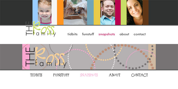
There weren’t any major layout changes this time, just some minor tweaks to the placement of a few things.
The new layout is a little more subdued than the last one. As you can see below, we kept our Ross family ‘logo’ and traded the jewel tone color scheme for a more muted palette.

Keep an eye out for some more changes to the site in the not-too-distant future. Barbara is planning on creating a new About section sometime soon!