As you can probably tell by now, we have redesigned the site. The basic layout is much the same as before, but now we have a new look for things.
Barbara did all the design work, creating the new look from her various scrapbooking resources (the new navigation menu is a combination of scrapbooking stuff and Barbara’s own drawings!). Then it was my job to take the concept work and turn it into graphics I could make a website design with.
Once that was done, I just tweaked the stylesheets and templates for the previous design to work with our new assets. Overall, I think it turned out very nicely.
If you have any comments/suggestions for us about the new design, please leave a note to let us know what you think!
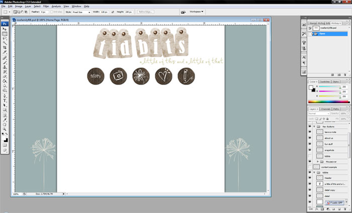
For anyone curious as to how things look when I create a site design, here’s a screenshot of the work in progress. This is what it should look like more or less. The little detail items (dandelions?) don’t display in IE 6 because it’s horribly out-of-date (upgrade to IE 7 or Firefox!) and when they are displayed, they actually ended up to the outside of the window (not exactly like the picture below, but close!).
